21er Haus · Abstract Expressionism · Advice · Aesthetics · Africa · African American · Ai Weiwei · Albrecht Dürer · Alcohol · Ali Cavanaugh · Amazon · Amsterdam · Andy Warhol · Animals · Animation · Antiquity · Apartheid · Archaeology · Architecture · Art History · Art installation · Art Market · Art nouveau · Art per se · Art Pharmacy · Art project · Art reception · Art Stage · Artemisia Gentileschi · Artist Project · Artist reunion · Artists about Art · Asad Raza · Asia · Astronomy · Atelier · Auction · Australia · Authenticity · Bach · Banksy · Barcelona · Baroque · Battle of the Sexes · Beauty · Belgium · Ben Enwonwu · Benin · Berlin · Bernini · Biennale · Bike · Bill Traylor · Biography · Biology · Border Film Project · Border-crossing · British Museum · Bronze · Budapest · Butterfly · Cameroon · Campbell’s Soup · Canada · Caravaggio · Cartoon · Cat · Charles Edward Perugini · Charles François Daubigny · Charts · Chicago · Children · China · Christian Art · Christianity · Cinema · City · Cityscape · Climate · Cloth · Clothes · Collection · Colours · Comic · Community · Construction · Consumption · Contemporary Art · Contemporary History · Count Ibex Collection · Countrysite · Cowboys · Craft · Crafting · Cuban Art · Cubism · Customize · Damien Hirst · Danny Lyon · Darkness · David Eichenberg · David Hockney · David Levinthal · Death · Debate · Deception · Decoration · Design · Destination · Detroit · Diego Rivera · Digi-Arts · Dimension · Diorama · Discrimination · Discussion · DNA · Dog · Domestic space · Drawing · Earthquake · Edmund Charles Tarbell · Education · Edward Hopper · Edwynn Houk Gallery · Egypt · Electricity · Élisabeth Louise Vigée Le Brun · Emotions · Erasure · Ernest Lawson · Ernest Mancoba · Erwin Blumenfeld · Ethic · Ethnology · Eugène Delacroix · Eva Lewarne · Events · Exhibition · Experiment · Fake · Family · Fashion · Featured Artist · Feminism · Figurative Art · Film · Fire · Flowers · Food · Form · France · Frankfurt · Frederick Goodall · French art · Frida Kahlo · Friendship · Furniture · Futurism · Gallery · Games · Garden · Geometry · George Sand · Gerard David · Gerhard Richter · Germany · Getty · Ghana · Ghosts · Gifts · Giotto · Giovanni Bellini (Giambellino) · Glass · Goethe · Gold · Good Idea · Gothic · Goya · Graffiti · Halcyon Gallery · Handcraft · Hans von Aachen · Harlem · Health · History · Horoscope · Huang Binhong · Hungarian National Gallery · Hyperrealism · Ibrahim El Salahi · Identity · Illustration · Imagination · Impressionism · India · Individuum · Indonesia · Interieur · Internet · Interview · Iran · Israel · Italy · Ivory · Ivory Coast · Jan van Scorel · Japan · Jasper Johns · Jaume Huguet · Jean Paul Gaultier · Jean-François Baudet · Jeff Koons · Jerusalem · JMW Turner · Joachim Patinir · Johannes Vermeer · John Singer Sargent · Joseph Karl Stieler · Journey · Jules Breton · Kaari Upson · Karel Appel · Karl Lagerfeld · Katsushika Hokusai · Kerry James Marshall · Keto · Kurt Hüpfner · Landscape · Latin America · Leasure · Leonardo da Vinci · Lifestyle · Lili Ország · Lisbon · Literature · London · Lorena Kloosterboer · Lorenzo Lotto · Los Angeles · Louver Gallery · Louvre · Love · Luck · Macchiavelli · Madrid · Magic · Malangatana · Malick Sidibé · Map · Marble · Marcel Duchamp · Marco Grassi · Maria Lassnig · Martha Pulina · Mary Stevenson Cassatt · Masterpiece Project · Material Culture · Matisse · Matthew Cherry · Max Friedländer · MC Escher · MEAM · Mexican Art · Miami · Michelangelo · Middle Ages · Mies van der Rohe · Minimalism · Mining · Mitch Griffiths · Mixed Media · Mobility · Modern Art · Mona Lisa · Moon · Morto da Feltre · Mosaic · Mozambique · Mulan Gallery · Munich · Murillo · Muse · Museum · Music · Mythology · Nathan Zhou · Native Americans · Nature · Neoclassic · Netherlands · New York · Nigeria · Norway · Nudity · Object · Oil paintings · Old masters · Orientalism · Osman Hamdi Bey · Pablo Picasso · Palestine · Paper · Paris · Pattern · Peace of paper · Pen and Ink · Pencil · Perspective · Peter Lindbergh · Philadelphia · Philipp Weber · Philosophy · Photographs · Photography · Places · Poetry · Poland · Politics · Pop Art · Porcelain · Portrait · Poster · Pottery · Power · Prado Museum · Prague · Presents · Printing · Protest · Psychology · Rainforest · Ramon Pichot · Raphael · Reading · Realism · Recycling · Religion · Renaissance · René Jules Lalique · René Magritte · Restauration · Review · Rings · Robert Rauschenberg · Roccoco · Roger Kemp · Romanticism · Rome · Rosa JH Berland · Royal Academy of Arts · Ruins · Russia · Rybolovlev · SAAM · Saatchi Gallery · Salvador Dali · Sappho · School · Science · Science Fiction · Sculpture · Seattle · Self-expression · Selfie · Sensation · Seoul · Sexuality · Shadow · Shakespeare · Shana Levenson · Shanghai · Shchukin · Sheryl Luxenburg · Show · Shuang Li · Singapore · Sketch · Slavery · Social Media · Society · Sophie Matisse · Sound · South Africa · Space · Spirituality · Sport · Spray painting · Städel Museum · Star Wars · State Hermitage Museum · Statistic · Still Life · Street Art · Strings · Surrealism · Surveillance · Sweden · Symmetry · Tanzania · Tate Britain · Tattoo · Technology · Temple · Textiles · The Metropolitan Museum of Art · The National Gallery · Theatre · Time · Tina Turner · Tips · Titian · Tom Watt · Tommy Hartung · Toronto · Townscape · TRAC · Travel · Turkey · UK · Underground · United Kingdom · United States · Urban Art · Urbanism · Valentin de Boulogne · Venice · Venus · Veronese · Vienna · Vincent Van Gogh · Voodoo · War · Warsaw · Washington D.C. · Water · Watercolor · Whitney Museum · Wild West · Women · World Culture Forum · World Press Freedom Day · Yoan Capote · Zhou B Art Center
 

Color Psychology – Blue

Color psychology suggests our mood can be impacted by different colors, each supposedly having a unique effect based on an individual’s personal experiences and culture.

Scroll down to enjoy a collection of beautiful work created by different artists on Strathmore papers; each featuring different shades of the color blue.

PSYCHOLOGY OF THE COLOR BLUE:

The color blue is universally favored by people everywhere. Each shade of blue can carry a different meaning and evoke a different type of reaction. Common associations with the color blue include:

  • Calmness and Serenity:
    Blue is often found in nature such as a calm sea and clear sky, creating a sense of peace. It can help slow the heart rate and breathing, making it a great color to surround yourself with for meditation and relaxation. Some airports have even started incorporating blue lighting and imagery in their terminals to help promote a sense of calm prior to flying.Art by @doughtycreartive – Colored Pencil on Strathmore 300 Series Bristol Paper
  • Dependability and Loyalty:
    Businesses often incorporate the color blue into their branding and campaigns because of the sense of trust it makes people feel. Blue is also often used in the suits of Superhereos (along with red to portray power).Artwork by @teganleighdraws – Marker and colored pencil on Strathmore 300 Series Mixed Media paper
  • Intelligence and Productivity:
    Research shows people are more productive in blue rooms, and certain shades of blue can improve concentration, stimulate thinking and provide clarity.
  • Sadness:
    Blue is commonly used to describe feelings of sadness. Elvis will be having a blue Christmas without you. A great example in art is Picasso’s Blue Period where he created very somber monochromatic paintings in shades of blue. During the Blue Period, which was supposedly influenced by a close friends suicide, he often depicted prostitutes, beggars, drunks.The Old Guitarist by Pablo Picasso
  • Unappetizing
    When it comes to food, the color blue is rarely found naturally. Human instinct tells us to avoid poisonous food, and blue coloring in food can be a sign of spoilage or poison. Some weight loss plans even go so far as to recommend eating meals off of blue plates to suppress the appetite.

How do you feel when you see the color blue?

Take a look at these beautiful pieces created by different artists on Strathmore papers; each featuring different shades of the color blue.

Artwork by @fuyuch7 – Colored Pencils on Strathmore 400 Series Toned Tan Sketchpad


Artwork by @daragh.obrien.art – Colored Pencils on Strathmore 400 Series Toned Gray Paper


Artwork by @gracelu.draws – Colored Pencil on Strathmore 400 Series Toned Tan Sketchpad


Artwork by @angelastaehling – Gouache on Strathmore Hardbound Watercolor Art Journal, 8.5″x5.5″


Artwork by @lenokdih – Soft pastel on Strathmore 400 Series Toned Gray paper

Artwork by @priscillageorgeart – Watercolor, gold leaf and metallic paint on Strathmore Watercolor paper.

Alexandre Wirth invites us to Open Our Eyes

IMG_5128The French painter Alexandre Wirth invites sighted people to open their eyes through his paintings using braille. I discovered his work on Instagram and was seduced by the poetry of his universe and his refined aesthetic. His black canvases play on reflections and invite us to look beyond the object.

He describes himself as self-taught and came to painting as a second career twenty years ago. His work matured into his series Open Your Eyes, which allowed him to break through.

He is represented by the Acid gallery based in Lille, France and has many projects to come. Thank you Alexander for sharing with me your universe!

IMG_9305
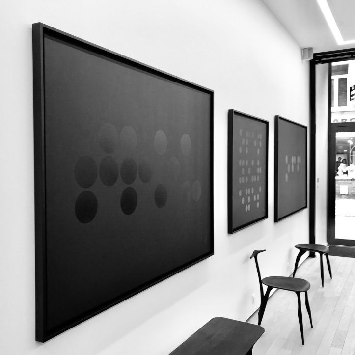
What was your artistic path?

It started at birth I would say! My father organized contemporary art festivals with recognized artists and at home everything revolved around and for art … More seriously, the fact of evolving in such a context favors reflection. For some unexplained reason, I did not want to study art; according to my opinion it is necessary to bring a new concept, a unique and clean identity. Of course it is also the result of our influences, observations and current cultures inevitably. So I decided about thirty years to paint and expose myself to judgments. The next step is a long process where ideas are put in place.

How did you get the idea for your Open Your Eyes series?

I started working on topics incorporating faces and flowers but wanted to look for a theme more meaningful to me.

I had a flash or I saw the rounds and their message … I adapted braille. Initially I used colors. Then I kept on exchanging with others and working, the black color imposed itself, the black has even become the catalyst!

IMG_5347
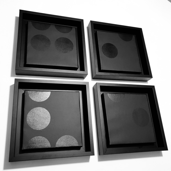
What is your goal with this series?

My paintings are questions. I like the idea that everyone can bring their response, their emotion and connect to their personal story. The goal is not only aesthetic but also to create an exchange. Is not art made for society to communicate and evolve?

Your canvases being black, how do you face the challenge of sharing your work?

It is the most complicated indeed. But it’s also a filter! I invite the curious to go beyond the black and the graphic to arrive at: “why? So I have no quick answer except to be available and engage with all those who want it.

IMG_9805Have you shared your work with visually impaired persons? Is it possible for them to read your paintings?

My work is for the sighted people. I even denounce the fact that society advances blindly without worrying about the future that seems complicated … I use the Braille graphics by provocation, doubled with black, to challenge, provoke, beg … so to answer, we can read only with the eyes and the only sharing is exchange and availability.

What are your projects ?

I have a lot ! I would like to work on sculptures to translate my work in 3D and to travel with my work … and what is positive today is that one can “travel virtually” and meet new people and their universe through networks , although of course this does not replace the experience in person. More than projects, they are ambitions, those of meeting, provoking and changing on my level certain mentalities that are too individualistic. To begin with myself …

To know more and follow

www.alexandrewirth.fr

facebook.com/alexandre.wirth

instagram.com/alexandrewirth_artistepeintre

Link to Laurence’s original article here.

What is Goauche?

First, let’s start with the pronunciation. It sounds like “gwash” and rhymes with squash.

Gouache is often described as opaque watercolor. While these two mediums have many similarities, gouache differs from watercolor in its quick dry-time and matte finish.

Janice Sung – Gouache on Strathmore 500 Series Ready Cut Watercolor, Cold Press
Goauche has a higher pigment content that is ground into larger particles than watercolor. This prevents it from granulating, causing opacity and a matte finish versus the translucent finish of watercolor. The bold, flat, poster-like finish makes it a versatile medium that is excellent for illustration, fine art and lettering.Below is a side-by-side comparison of artwork completed by Minnie Small in gouache (left) and watercolor (right).

Unable to display Facebook posts.
Show error

Error: Error validating application. Application has been deleted.
Type: OAuthException
Code: 190
Please refer to our Error Message Reference.